In parallel with my workshop build I was completing my product design A-Level.
In an effort to link the two, and because I was still considering architecture as a career option, I wanted to focus my coursework on a building. Designing a tiny house seemed like the perfect compromise—indeed I often wonder if I could live in my shed!—and it also allowed me to consider interiors and furniture.
Sadly, actual construction fell outside the scope of the course, so this design is for a scale model of the house. This didn’t change the design process much but I did think about mounting and model assembly in my research.
Here I detail the design process, from initial sketching to practical prototyping.
The fully formatted coursework submission is available here.
Site planning and contextual research
The proposed site was in a copse under the shadow of Lincoln’s medieval cathedral. Surrounded by historic buildings, it was important to consider how the tiny house could complement the local area; fortunately the trees provided some privacy and meant I could experiment with materials.
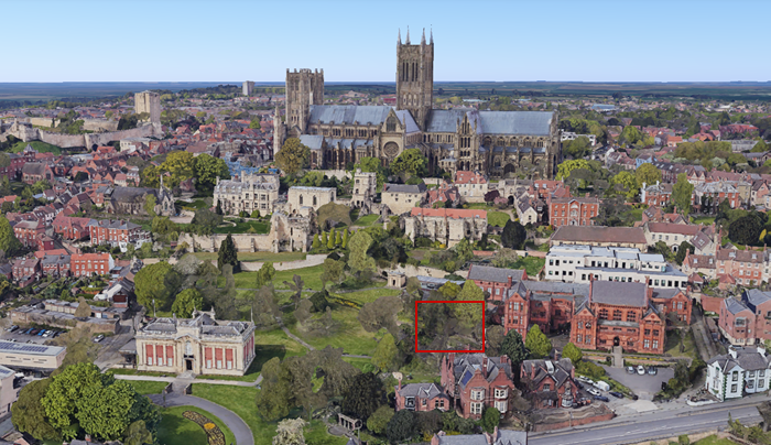
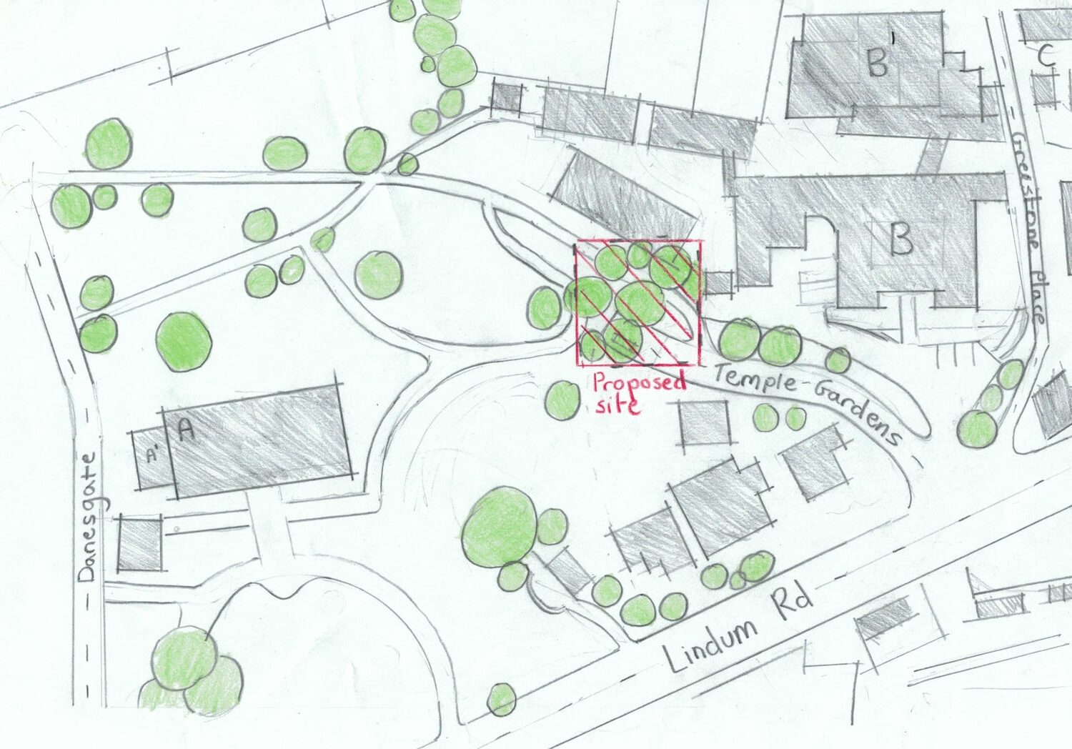
I was particularly influenced by the red terracotta of William Watkins’ adjacent Christ’s Hospital School and the contemporary extension in the nearby Usher Gallery.
Initial designs
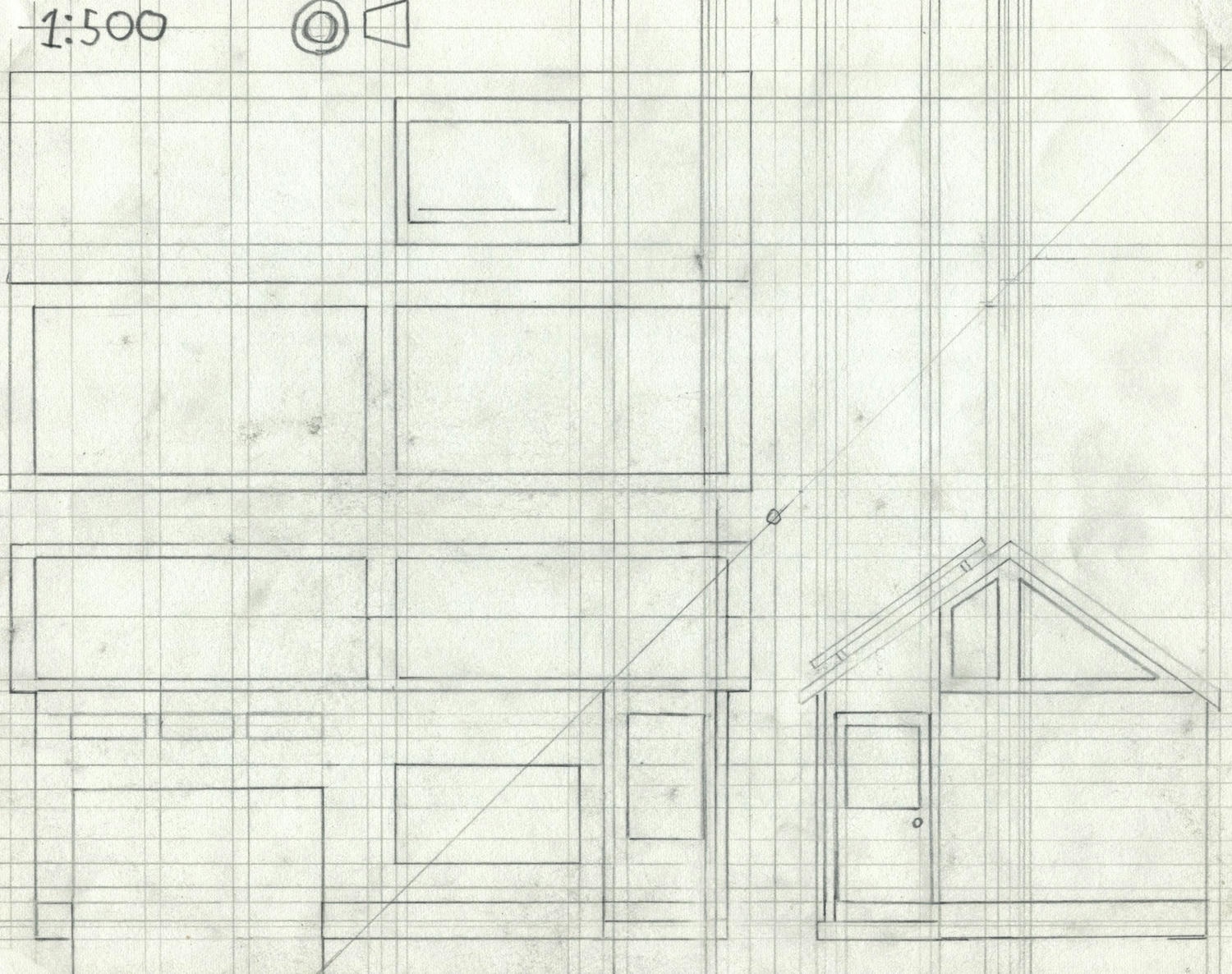
With some background research completed, I got started on paper trying to form a wide range of initial ideas. Following rough sketching my ideas eventually converged into the four designs below. As part of the coursework I had to put together a detailed design specification, but as it’s rather dry and non-visual, I’ve excluded it here.
#1: Saltbox cottage
Influenced by New England cottages, this first drawing seems a bit out of place on the slopes of Lincoln.
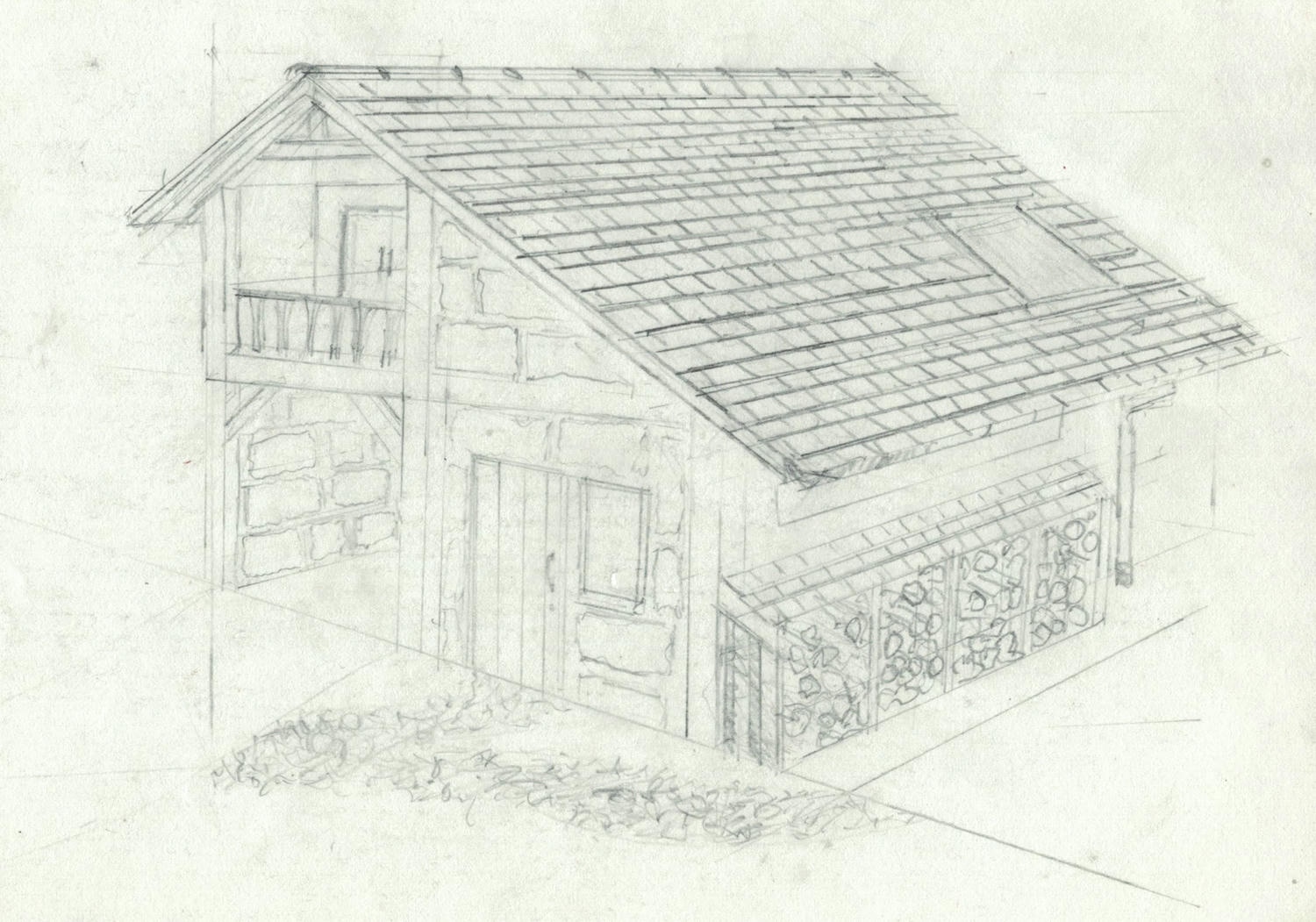
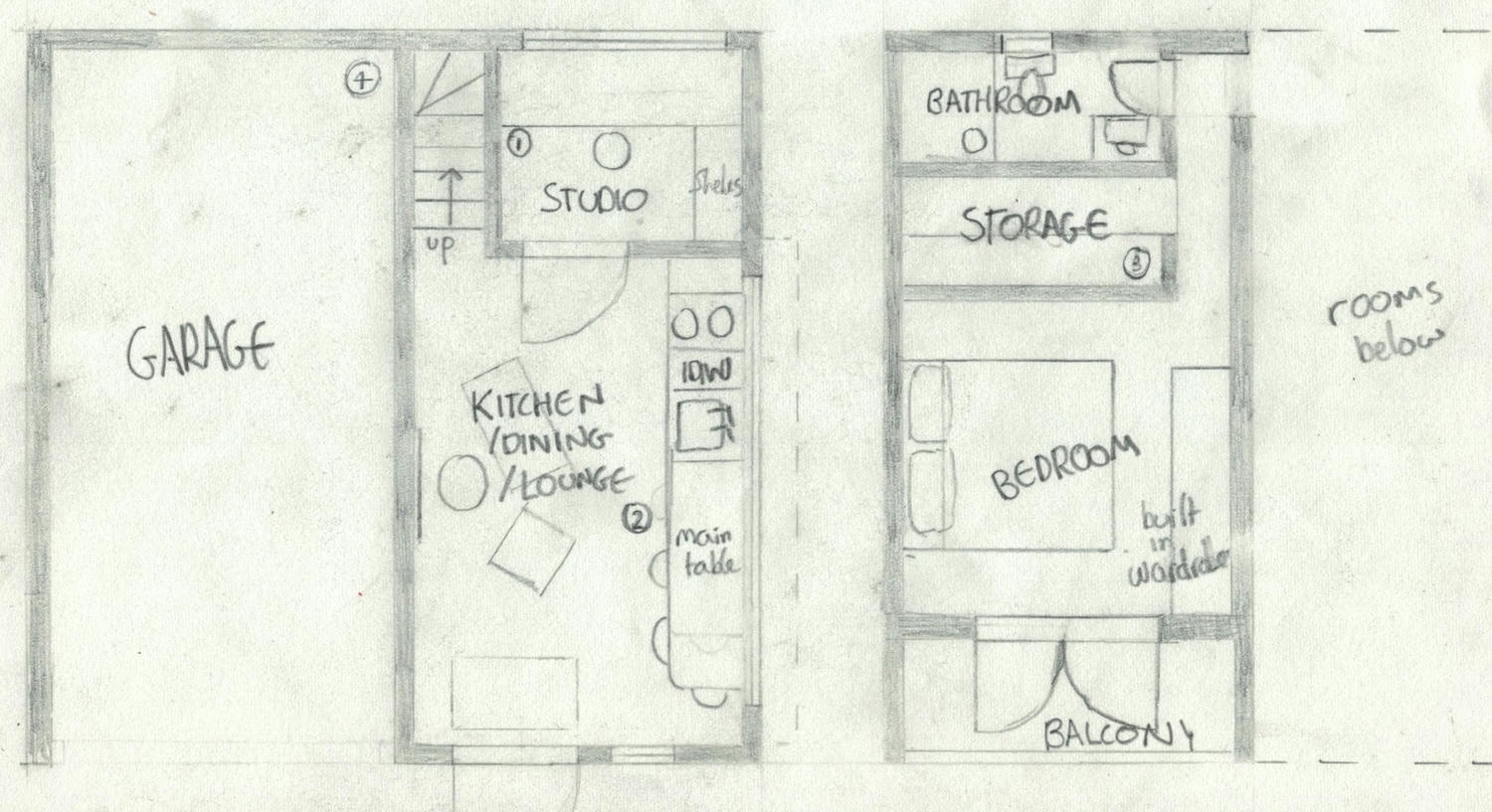
It’s a multi-level design incorporating a garage, a special request of the client. One strength is the split between public and private space which I think is a real positive in a building of this size. Unfortunately, this does leave the interiors looking a bit cramped on paper, and I’m not sure it would be a practical place to live.
#2: Mono-pitch bungalow
In attempting to include a larger shared space, this iteration includes a ‘double row’ interior with the kitchen diner acting as corridor access to other rooms. Clerestory windows provide ceiling-level lighting across the building and sliding doors enable access to the narrow patio for sunny days.
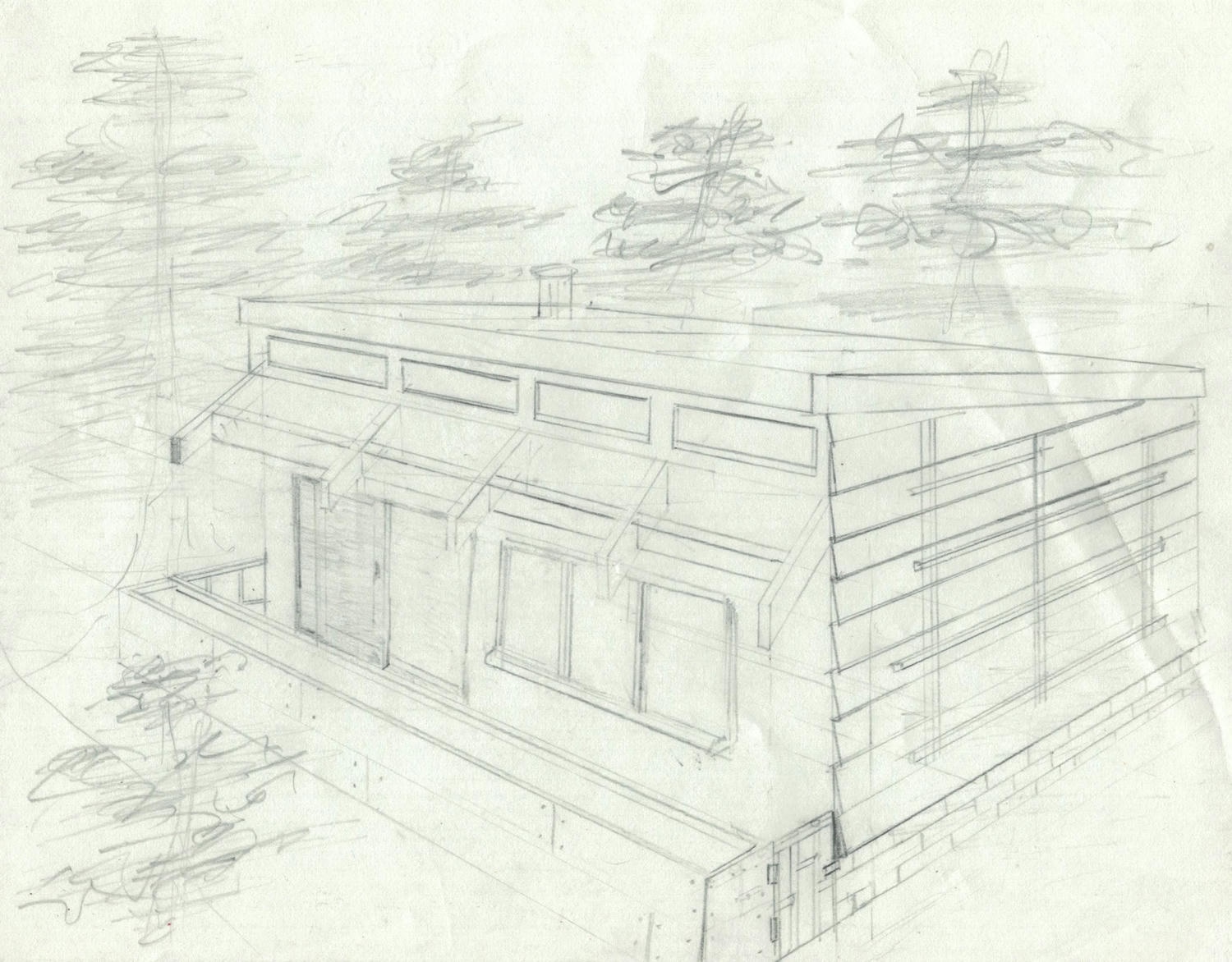
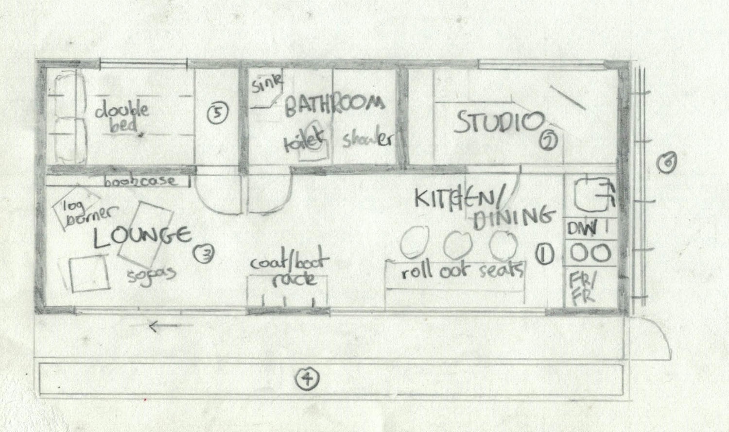
I had fun with the floorplan for this design, but again, I’m doubtful of the layout’s practicality. The bedroom in particular is small, with the patio and plant beds taking up precious space.
#3: Sunken garage
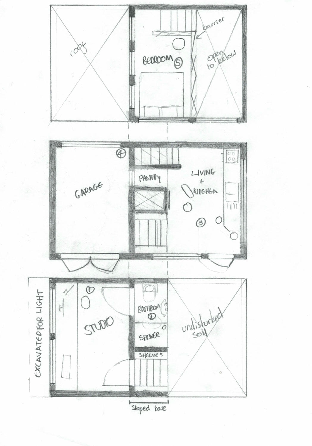
By my third design iteration, I was more focused on utility leading to a slightly more blocky building. Drawing from the ‘Saltbox’ building, this plan is again split level over a integrated garage. The garage is sunken to provide a more usable space above.
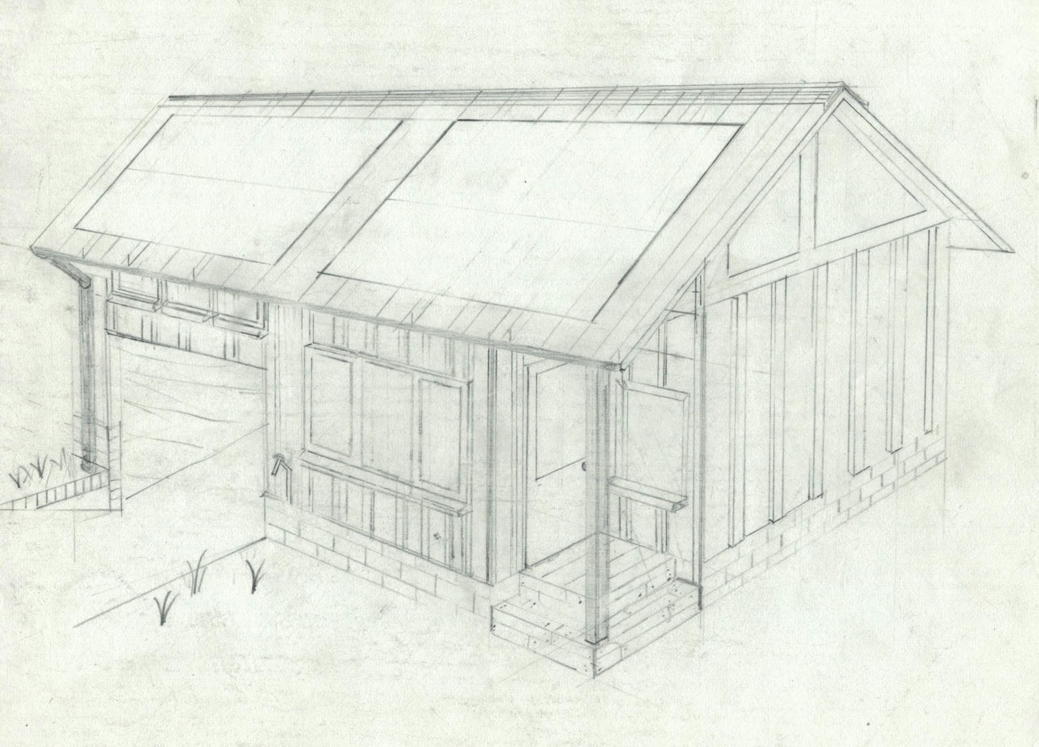
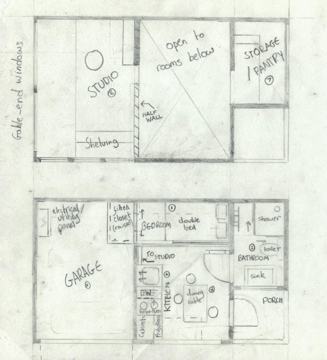
One of my favourite features here is the ‘balcony’ studio looking over the public space in the house. The studio itself is arguably too large, especially given how cramped the bedroom, bathroom and kitchen turned out. The corner porch was an attempt to make the plan more interesting: it looks nice but costs precious space.
Board and batten timbers clad the design providing an attractive, if slightly American, facade. It was in this design that I thought a red ‘corten steel’ roof might work, and this is a detail I carried through to the final specification.
#4: Clerestory garage cabin
This final development again uses clerestory lighting, present on many medieval cathedrals including Lincoln’s. The split-pitch design maximises ingress of light at the expense of usable space over the garage. A basement studio, separate from the distractions of the rest of the house, is located below the garage, with glass windows on the floor and roof of the garage providing natural light.
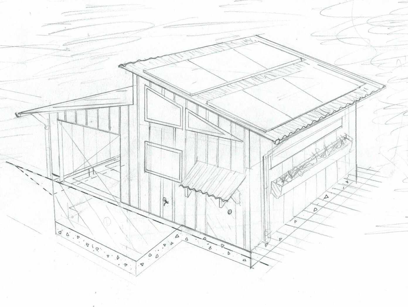
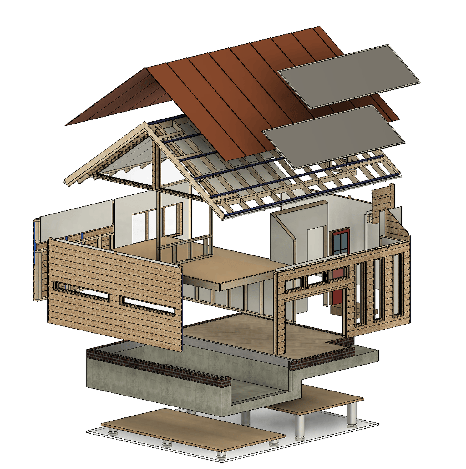
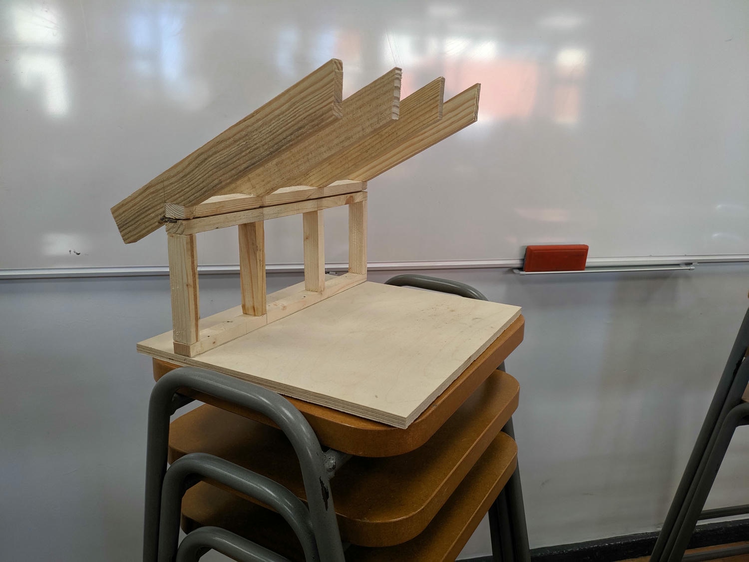
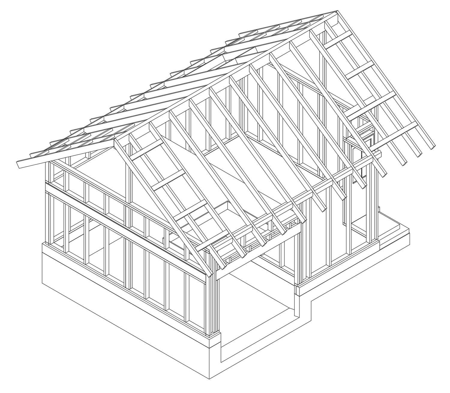
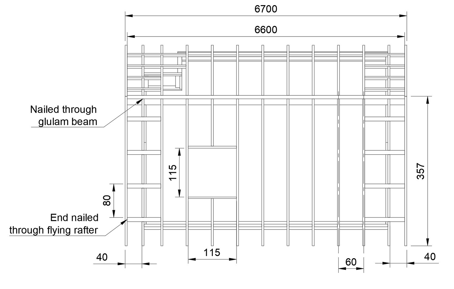
A drawback of this roof design is its more complicated framing. Typically, a roof consists of angled rafters forming the roof surface, and horizontal ties preventing the weight of the roof from pushing the walls apart. We can instead use a structural roof beam supported at each end to remove horizontal reaction forces from the system.
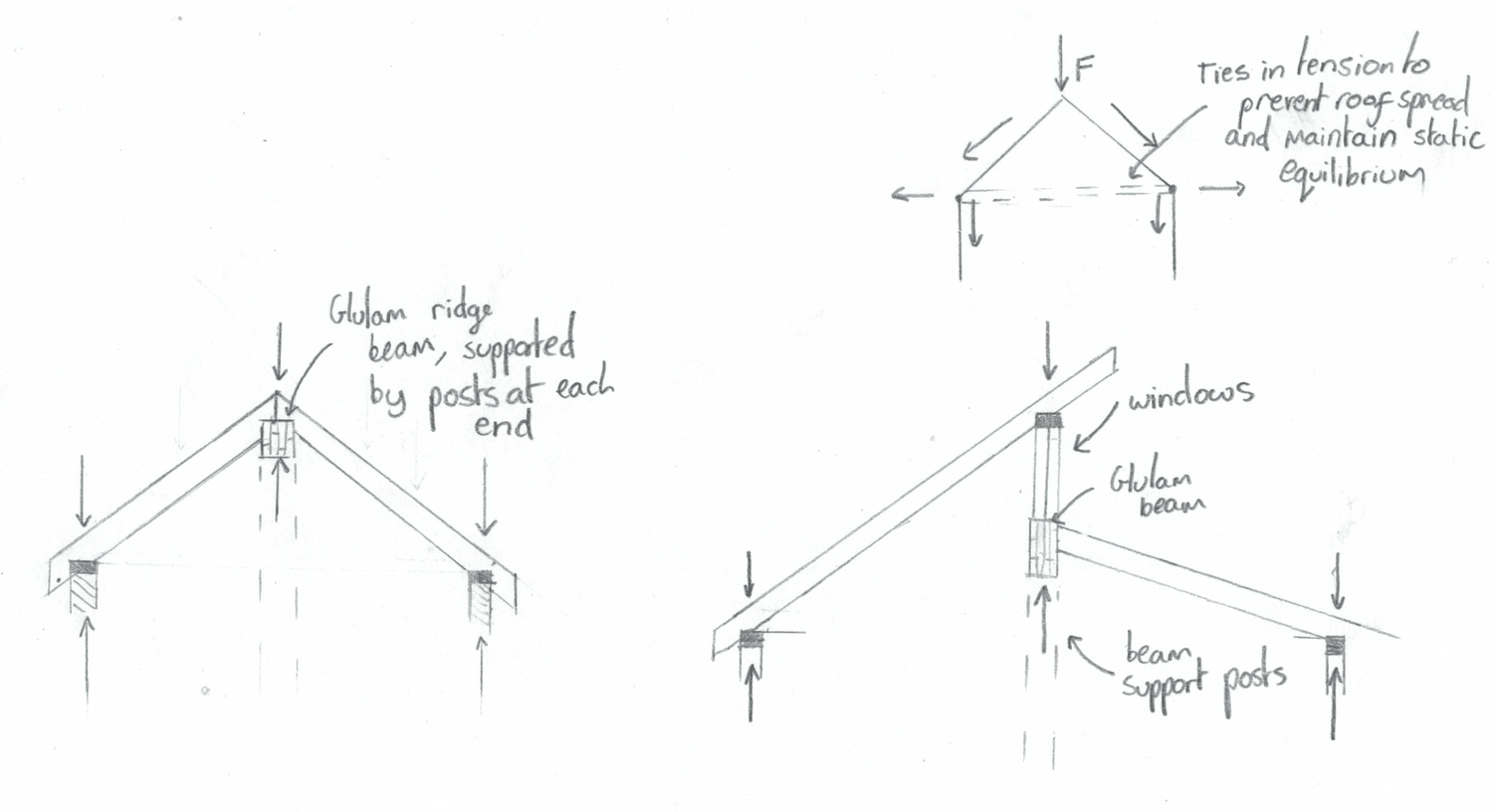
Here that structural beam forms the base of the load-bearing clerestory, with the steeper right rafters resting atop that.
Design development and detailing
With various ideas formulated I attempted to take the strongest features from each and incorporate them into my final design. Development also included practical considerations about the construction and weatherproofing of the structure.
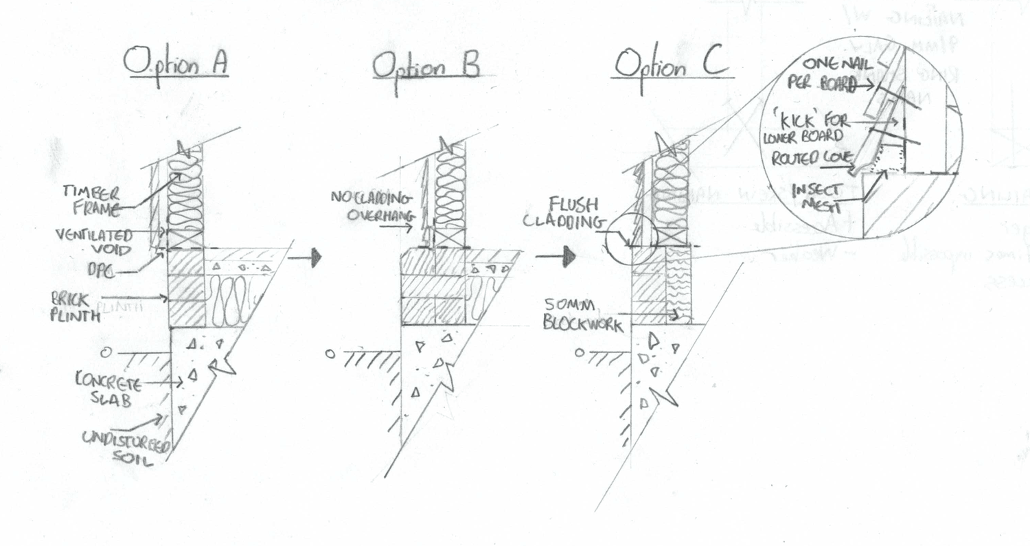
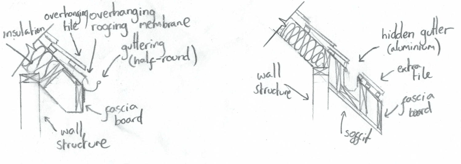
Details such as foundation structure and wall-base interface were things I had already considered while designing my shed. Replicating them in my design was straightforward: an Option B plinth was specified with a standard external gutter.
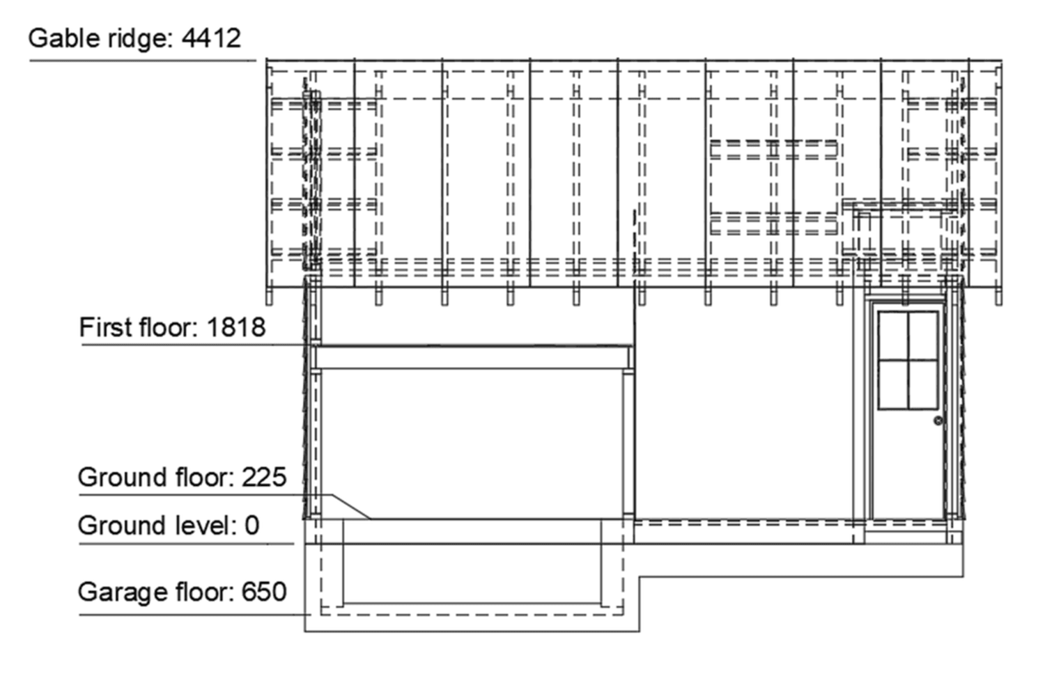
Another thing to think about was levels. I was keen on the sunken-garage design and wanted to ensure the space above it was comfortable for use as a bedroom and studio. Referring to building standards helped ensure ceilings were high enough for comfortable use.
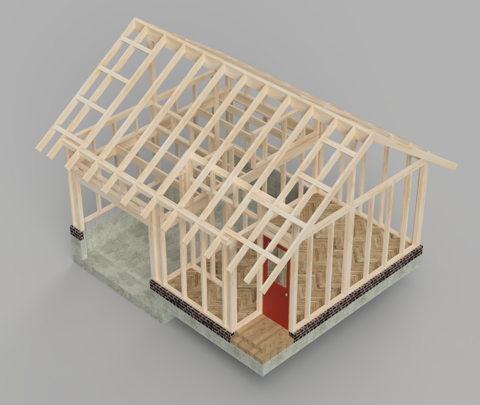
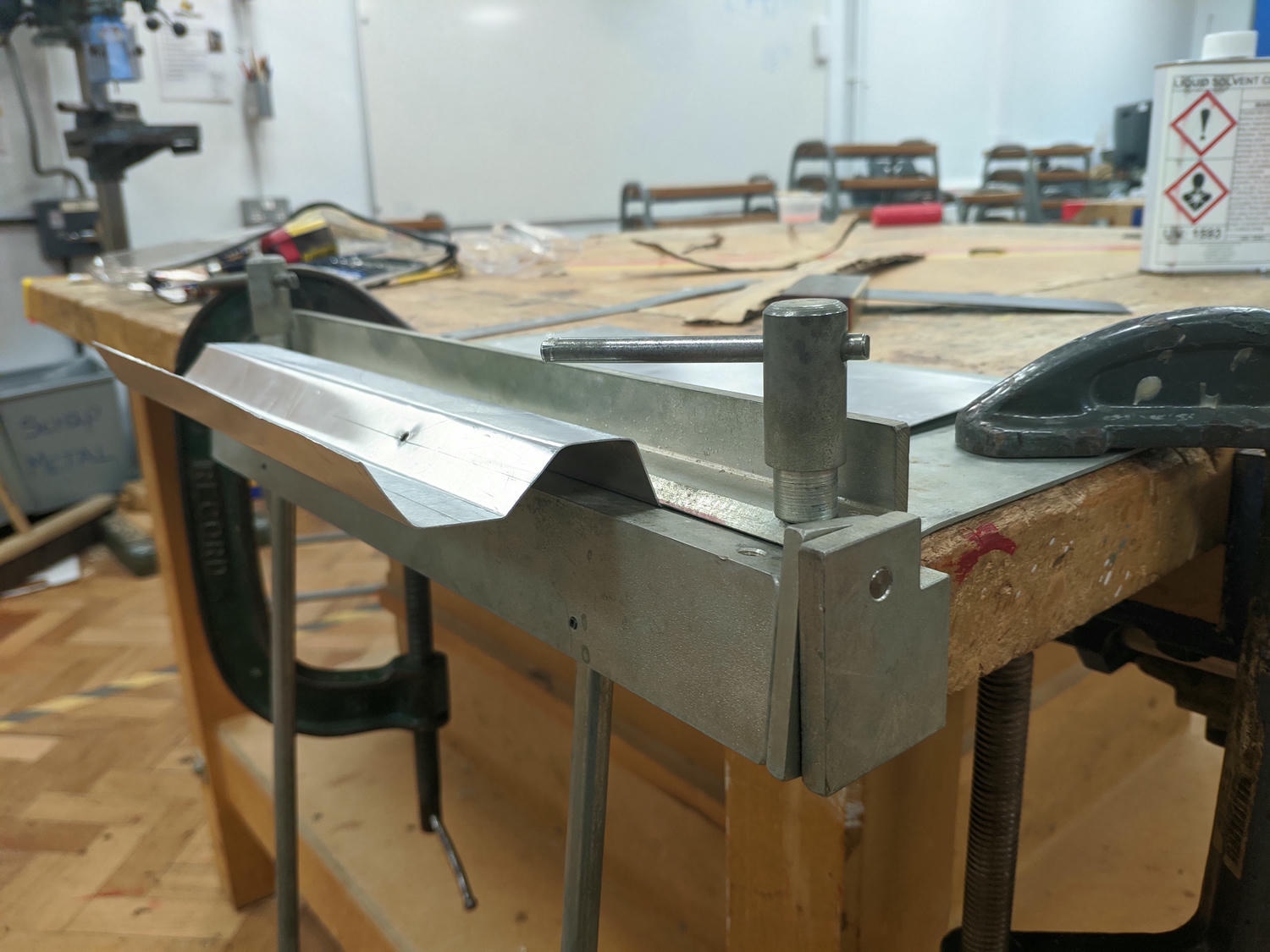
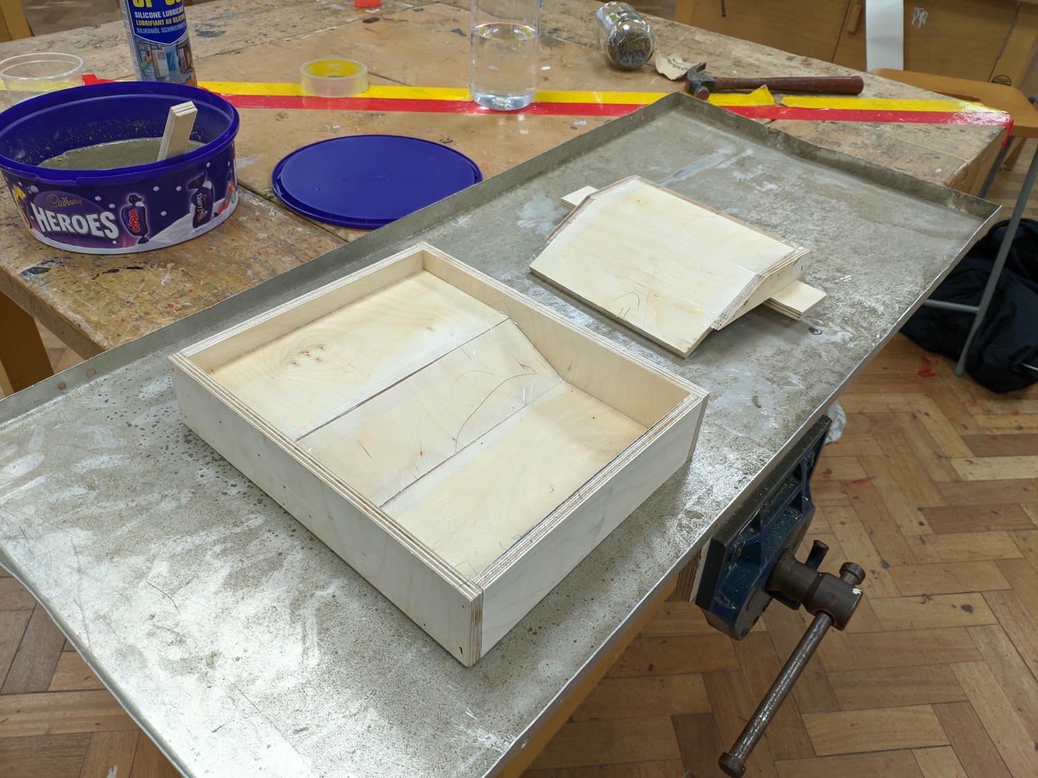
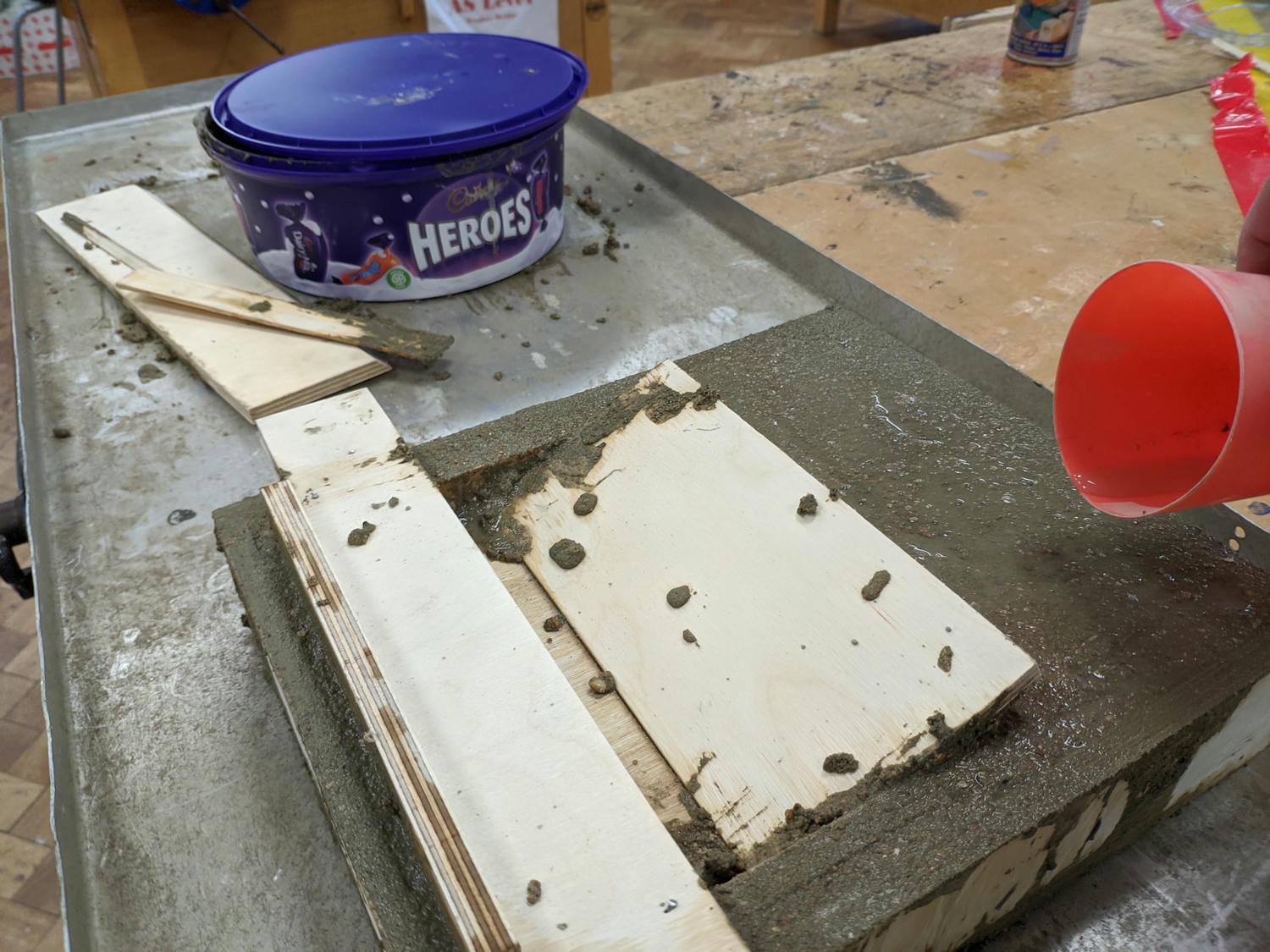
During development I experimented with some practical model design, including building a test stick-frame structure and pouring a concrete plinth with a sunken basement.
Final design
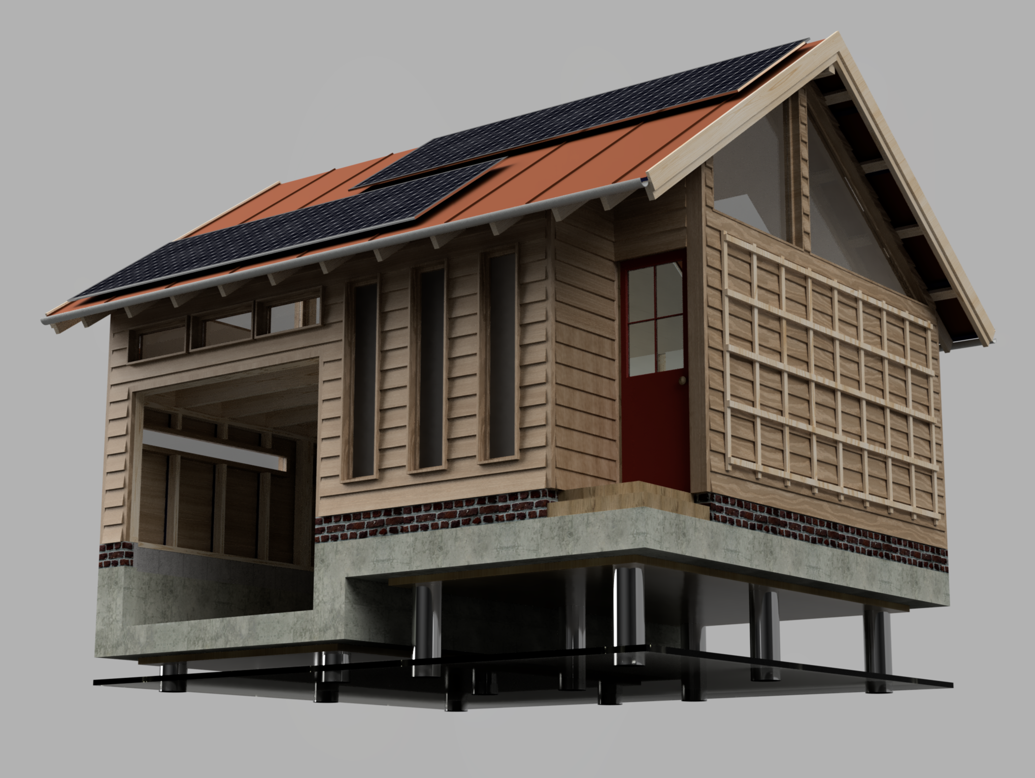
The final CAD model came together over a few weeks of iterative design and experimentation. It builds mostly upon my ‘sunken garage’ initial sketch, retaining the general proportions but improving on interior and layout.
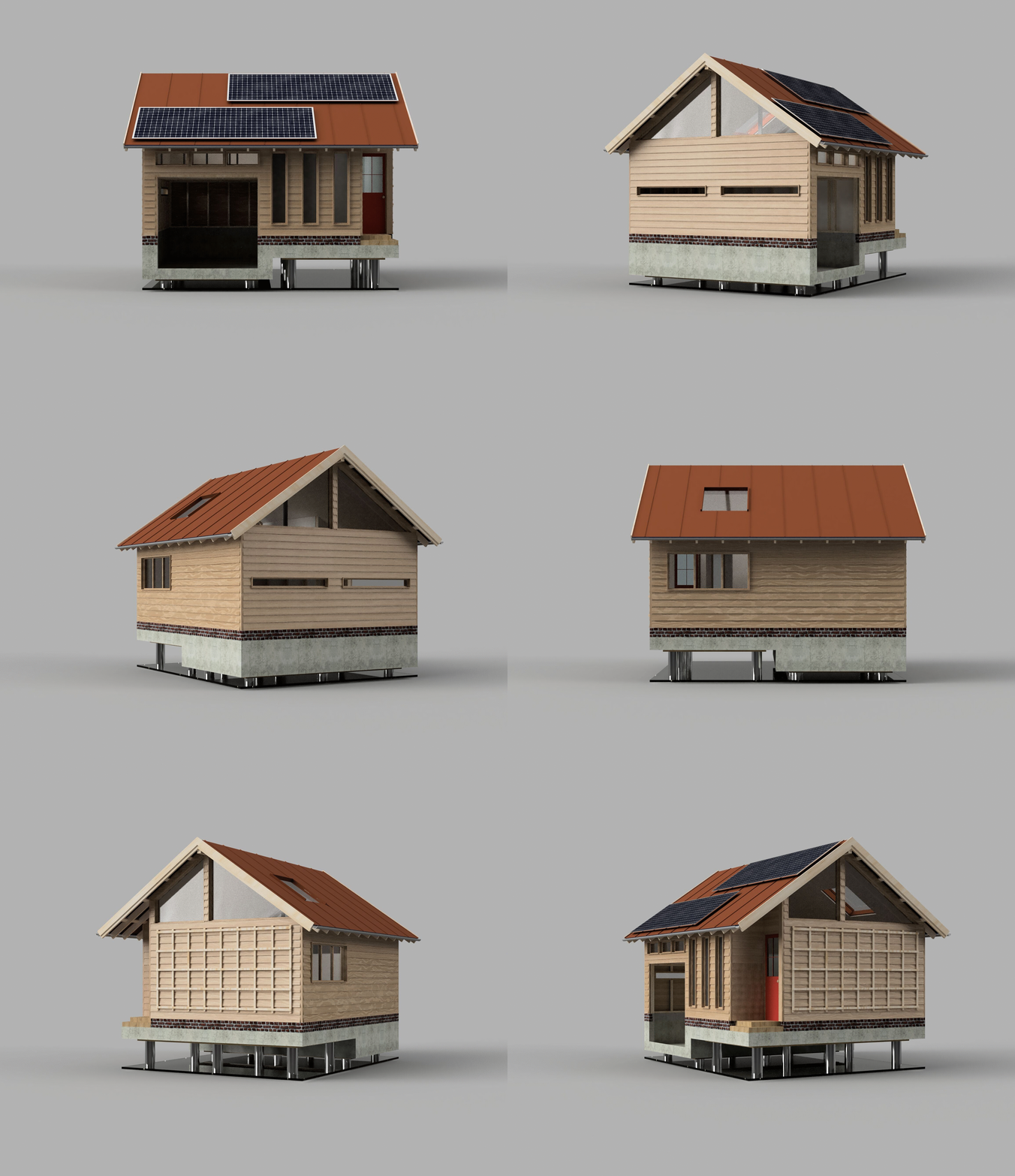
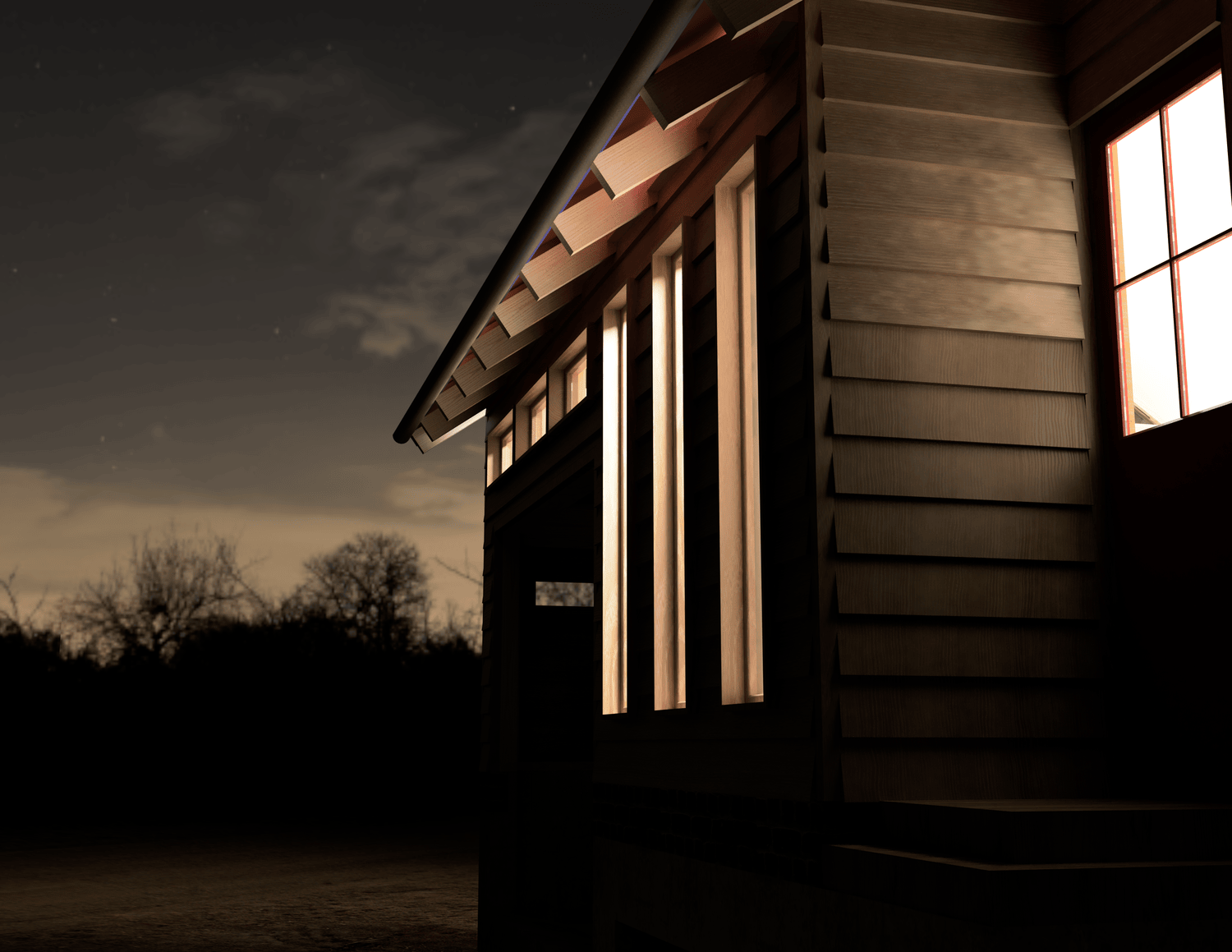
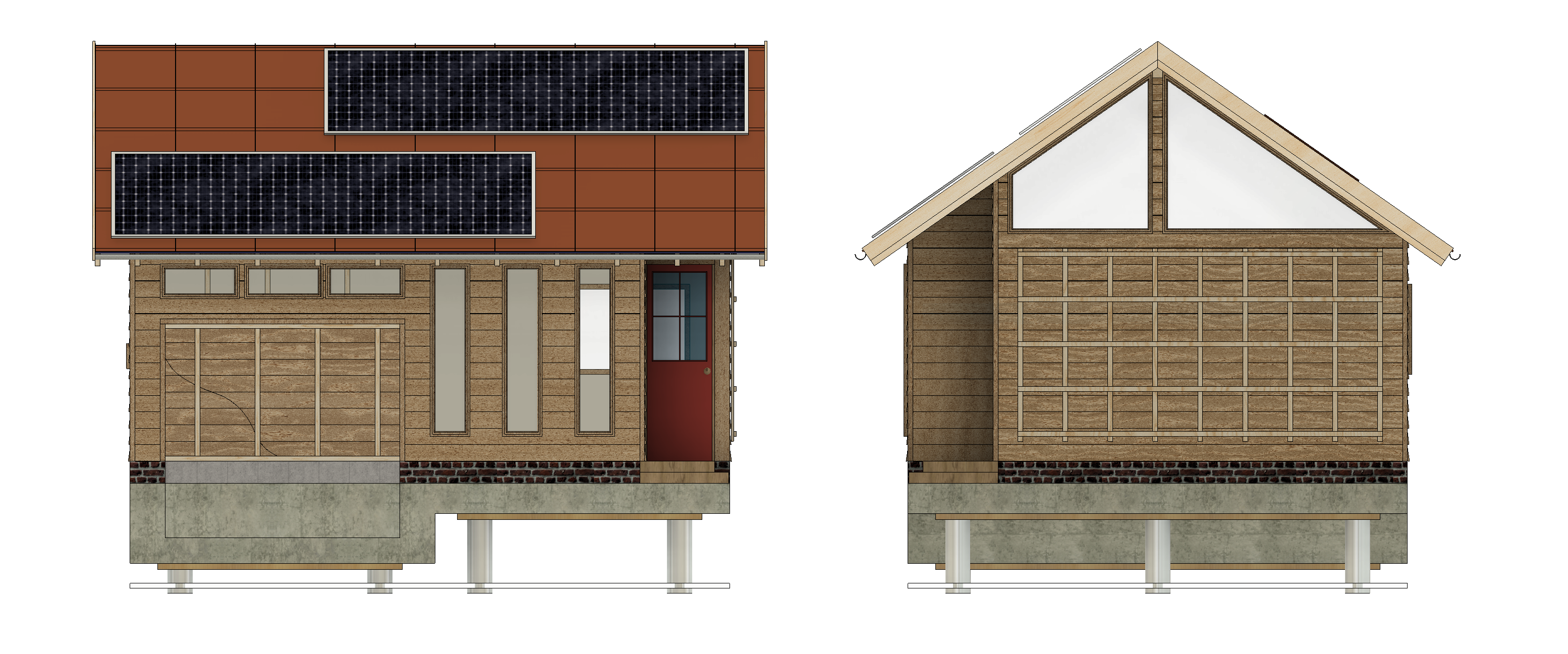
The tiny house is set on a concrete slab foundation, which includes a sunken platform for car parking. A slope dug into the site acts as an access ramp. The structure is stick framed with oak featheredge cladding and custom built windows; I was particularly happy with the window layout on the front facade. A brick plinth raises the wooden frame and provides some variation in the walls. The roof is covered with corten steel sheeting: this is a material is designed to weather to an attractive red-brown, matching the reds on the nearby terracotta school.
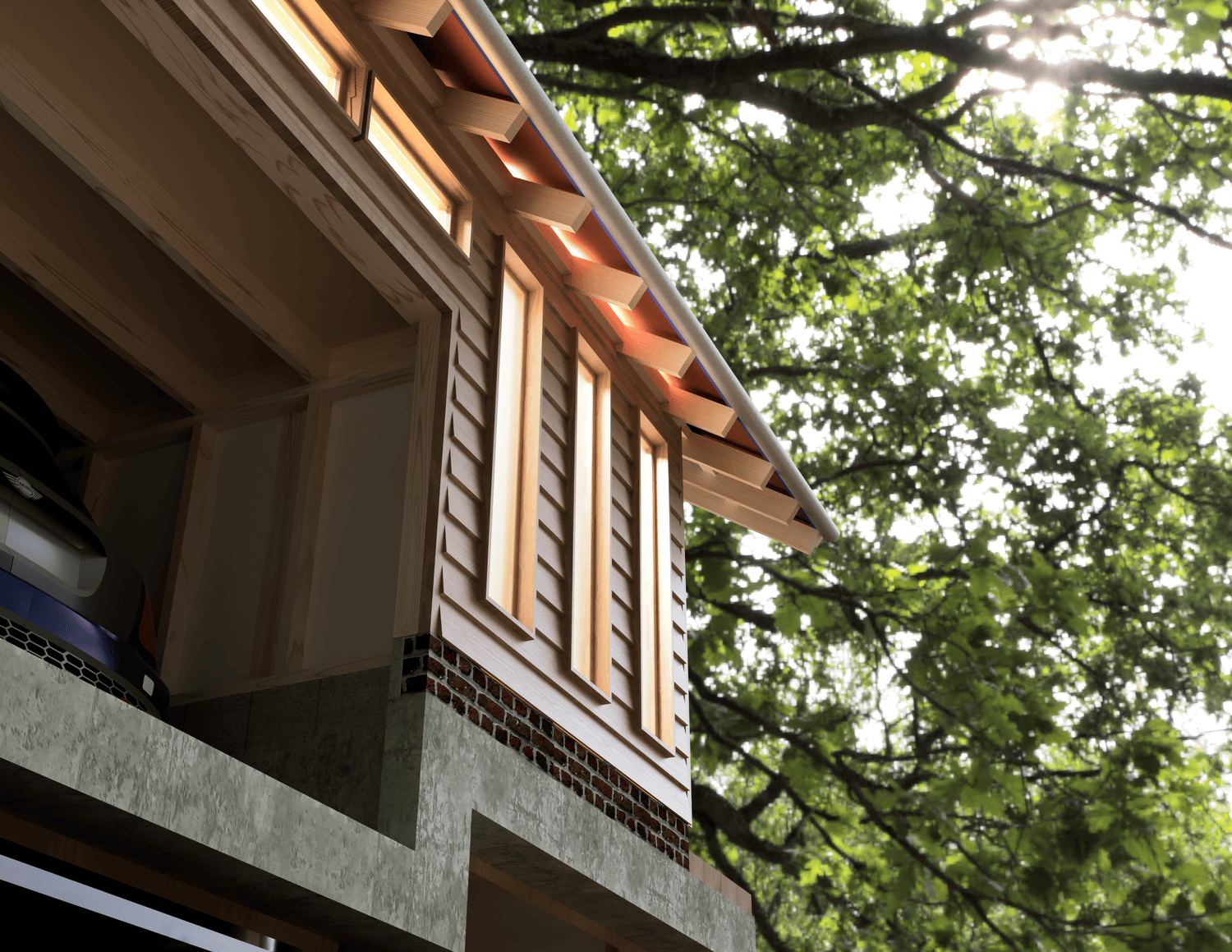
Narrow windows light up the garage while preserving most wallspace for storage and tools. Additional lighting is provided through gable-end windows at either side of the structure. The East side of the house includes a trellis for climbing plants and solar panels on the roof provide energy for heating.
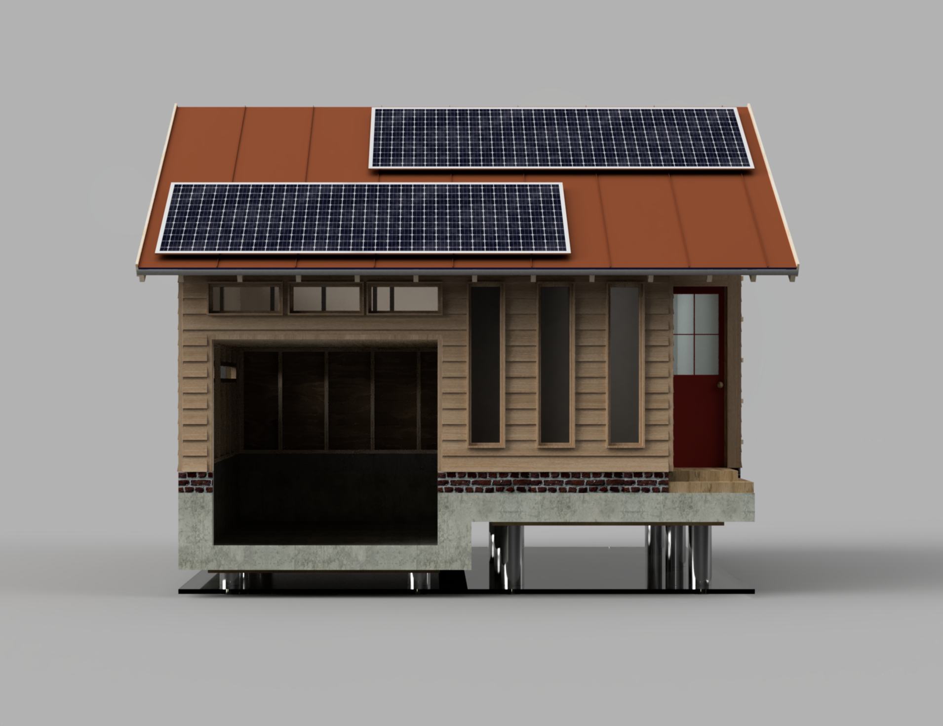
I’m really pleased with the exterior of the structure and think it would fit well in the wooded setting it was designed for. As part of the ‘model development’, I included a metal and acrylic stand for the house to sit on.
Interiors
With such a tiny house, the interior is arguably more important than the outer shell – it’s design decisions here that can make a building a joy or nightmare to live in. Given this, I spent considerable time thinking about furniture and layout solutions to maximise the comfort of the space.
One way I did this was by printing out a rough floorpan with the key dividing walls, and sketching potential furniture placement. All white goods are to scale.
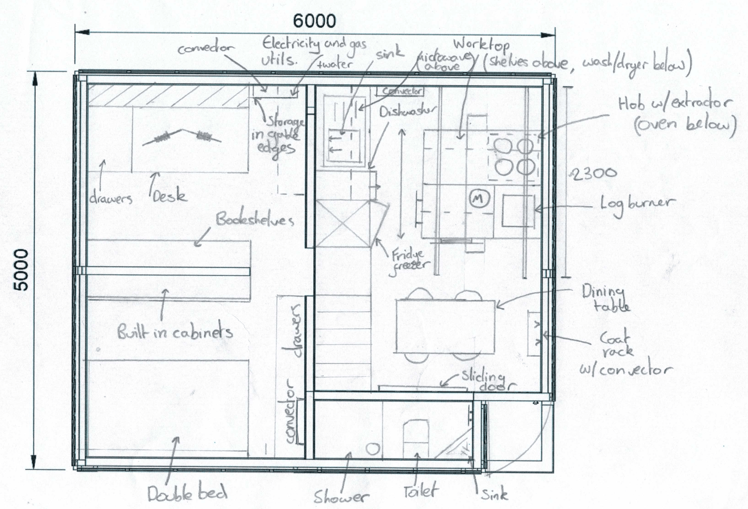
The key limitation I ran into was the size of the living area. To address this, I drew up plans for a custom sliding island: one side would contain the kitchen countertop and hob, with the other holding a log burner and TV. While cooking the island can be positioned in the outward position; when hosting guests it can be moved into the corner, opening up the space.
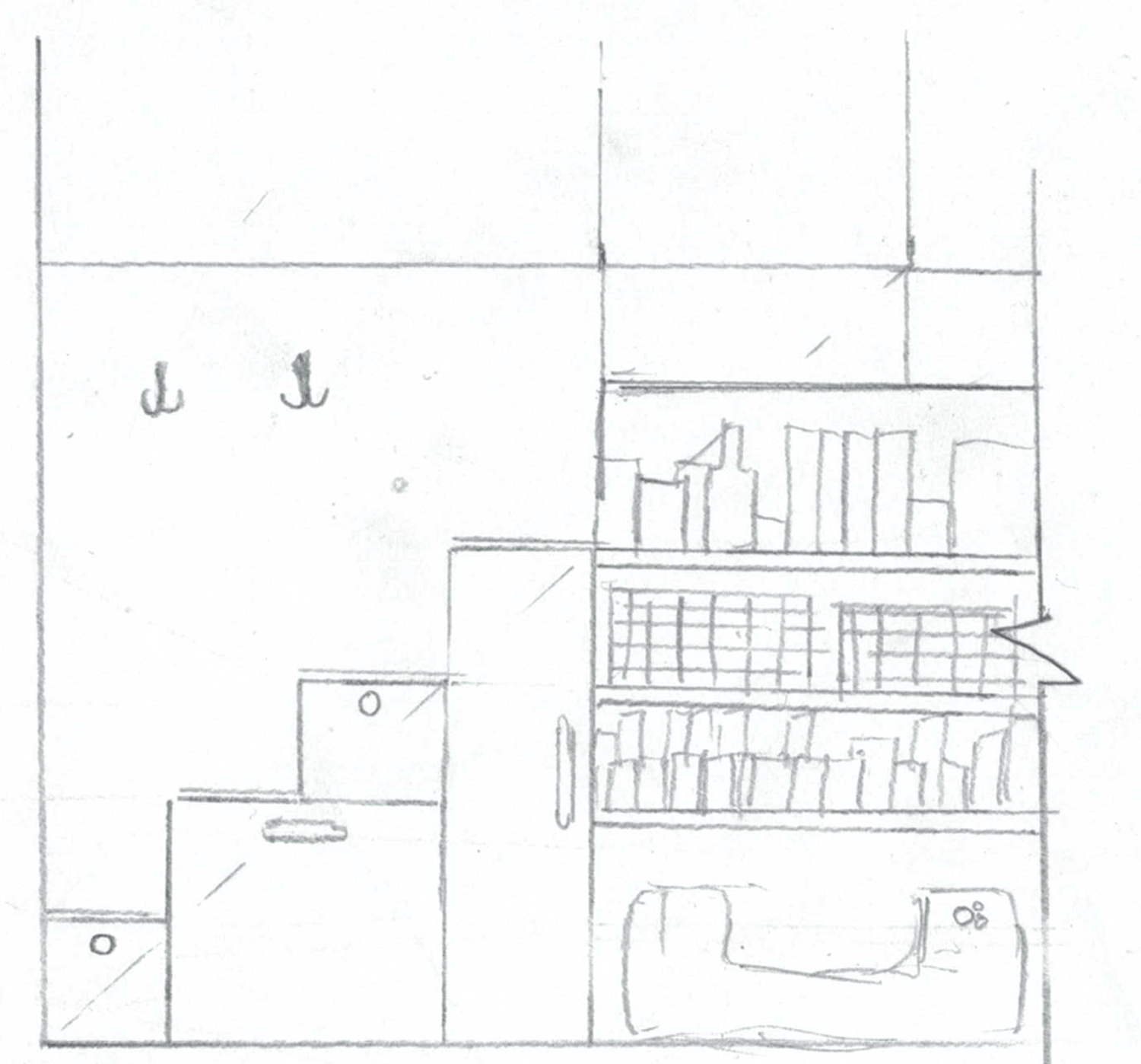
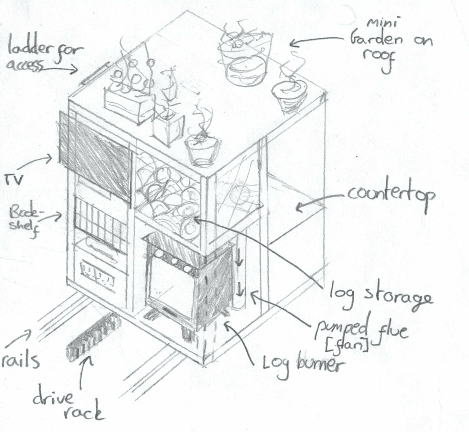
The staircase was also carefully designed to include general storage, a pantry and space for a dog to sleep! The gable bedroom and studio look over the living room with a half-wall divider, and are lit by the large gable-end windows.
Practical: Sliding island prototype
At the last moment, a badly timed COVID lockdown wrecked my plans of actually building this model. Instead, I had the opportunity to focus in on a particular feature that would benefit from a prototype and built it over a few days. The sliding island mechanism seemed like the perfect candidate and I got to work on a scale model. To ensure the island can be easily moved, the mechanism is driven by a motor for button-press activation.
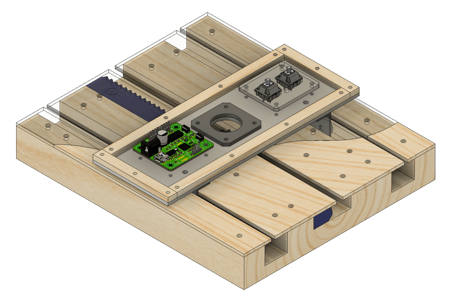
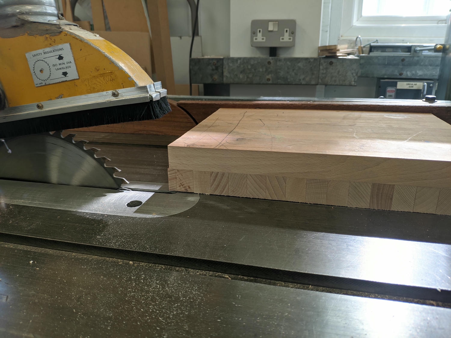
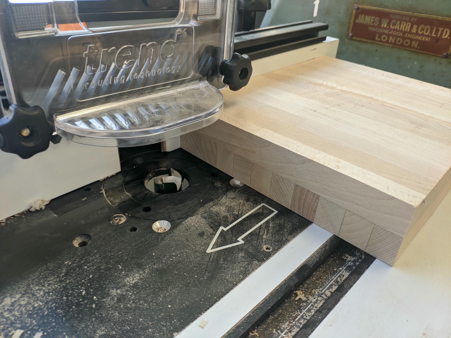
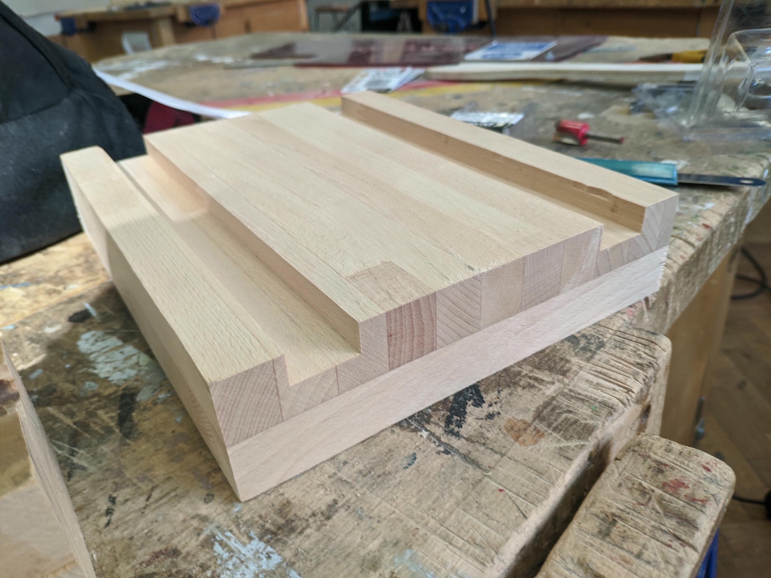
The mechanism implemented is a simple rack and pinion with a motor located on the carriage itself. I started by gluing two bits of surprisingly good quality scrap together and cutting them to size. I then routed out slots in the block for rails and the rack – this was my ‘foundation’.
Next, I 3D-printed the drive elements and used a mill to create the linear motion components. Bearings mounted on slots in the rails allow for adjusting slack out of the system. Laser-cut wood and acrylic act as the ‘floor’ over my ‘foundation’ and showcase the mechanism.
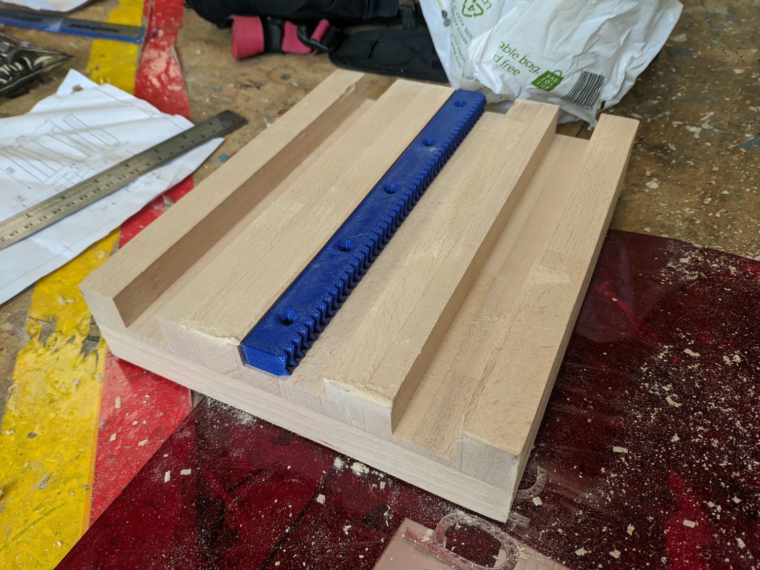
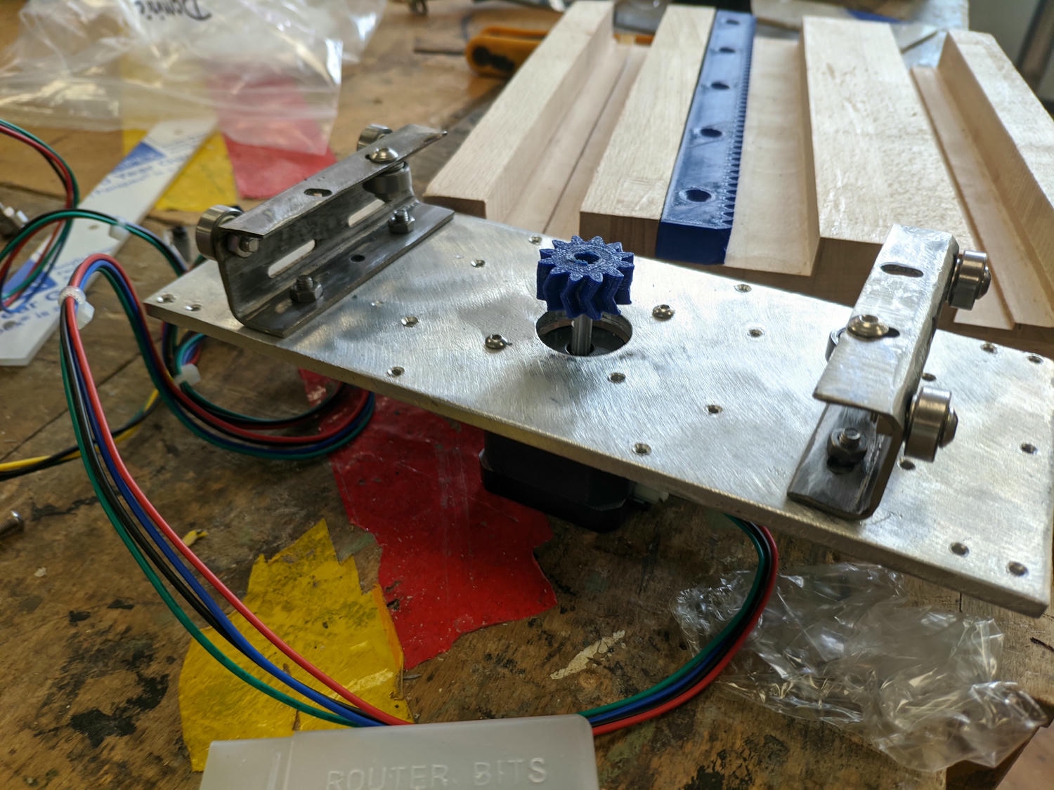
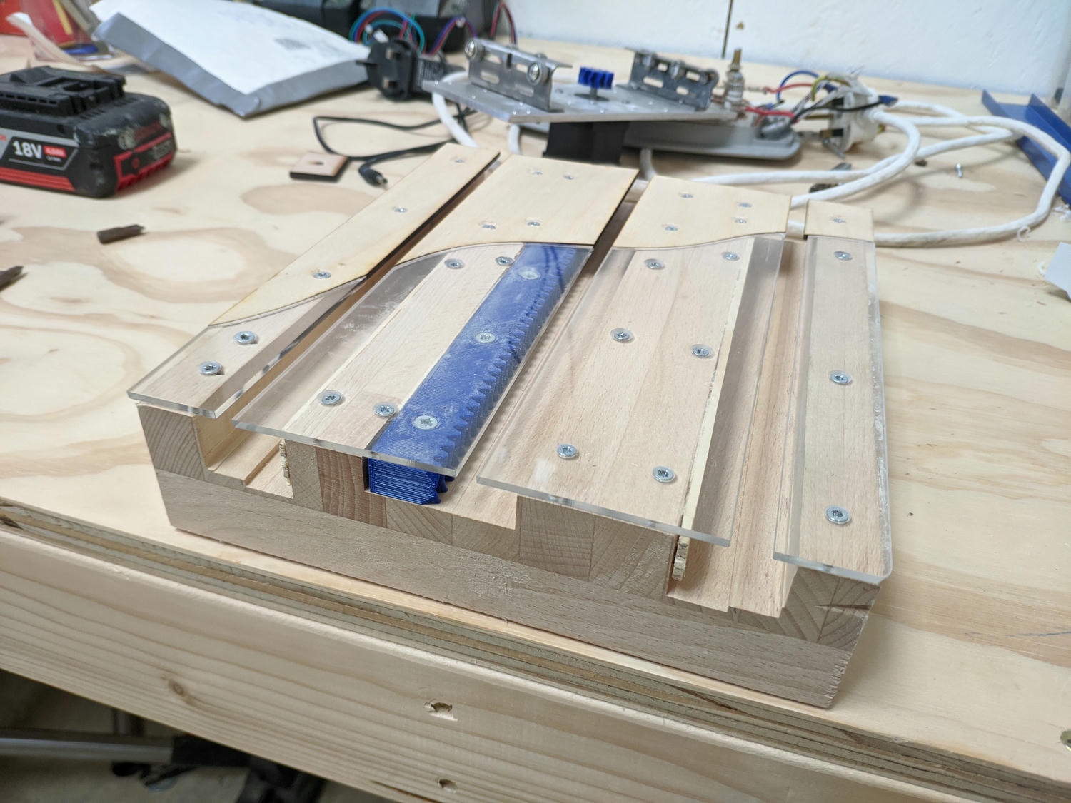
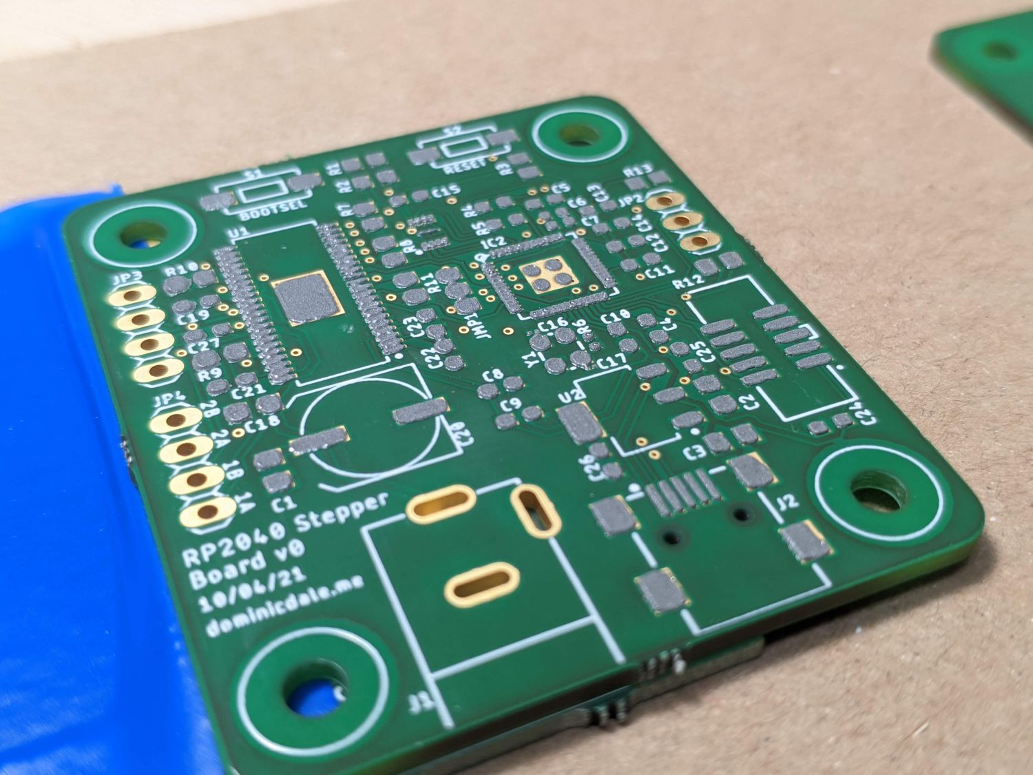
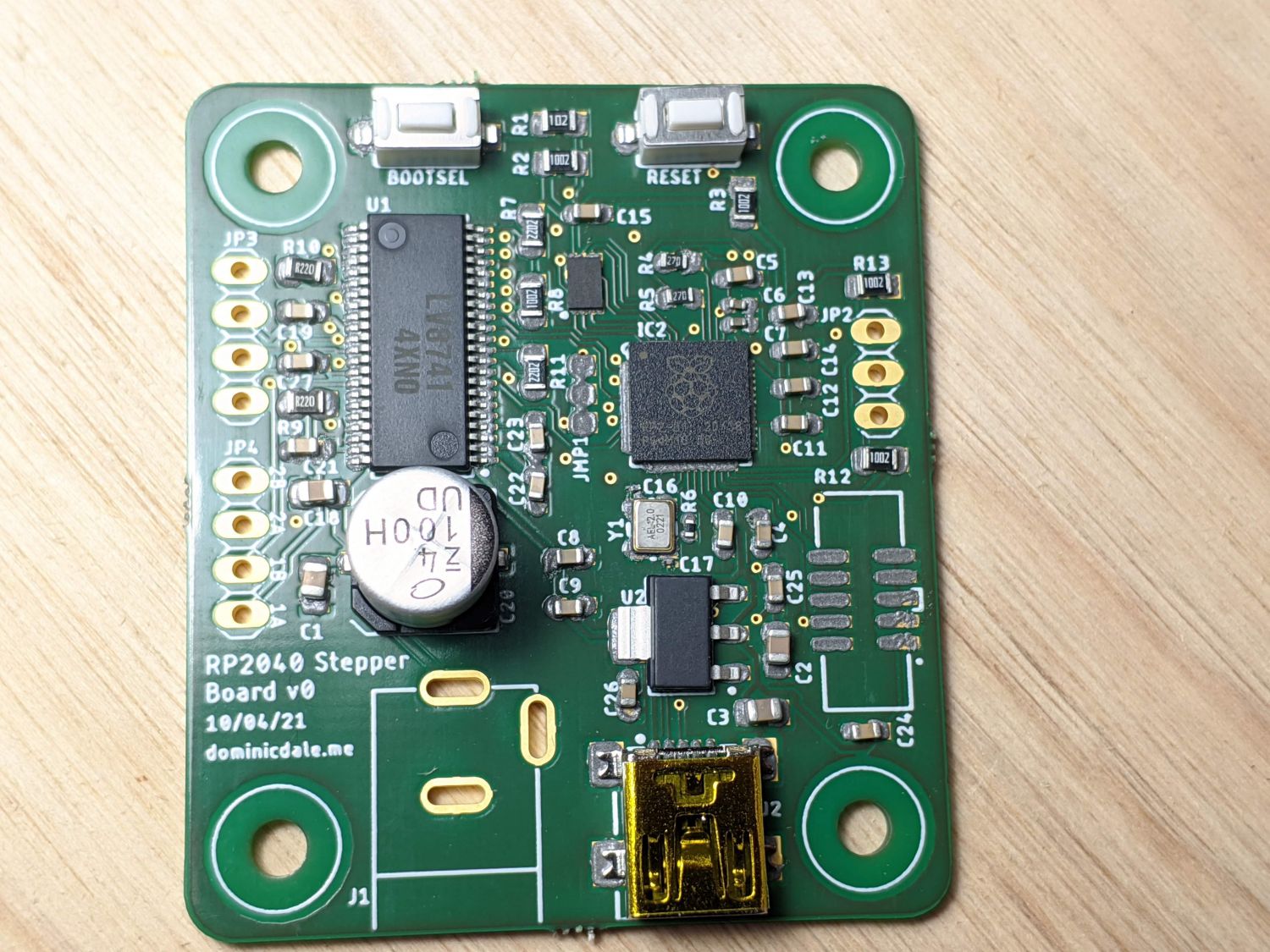
Because I decided to use a stepper motor for movement, I needed to build a drive and control electrical board. This was designed a few years ago, so it’s not my most elegant work, but it did function as intended.
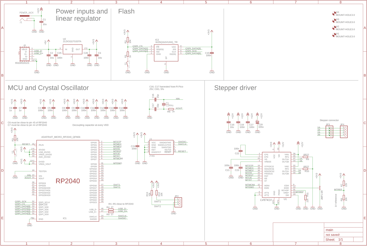
The MCU is a RP2040 and the board implements USB, a buck converter for +3V3 supply and a stepper driver. This was also the first time I had specified crystals and flash around a microcontroller.
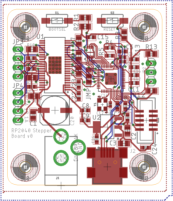
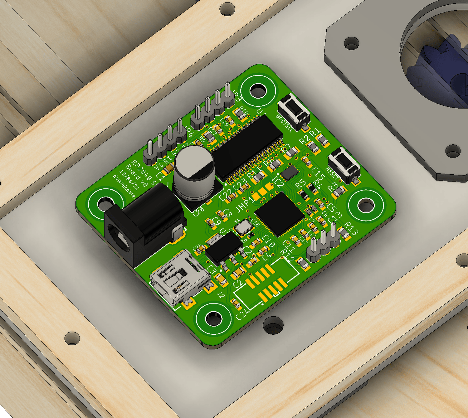
My homemade reflow plate (an upside-down iron) and a stencil made quick work of the PCB assembly, but mistakes in the schematic meant I had to rewire the USB connector.

The completed demo fulfilled its function well, despite being just a small feature of the original design.
Conclusion
Alas, this tiny house design will have have to remain digital for now—but overall I’m really happy with the results. I’m continually impressed with Fusion 360’s modelling capabilities and rendering, with the outcomes reflected in the graphics and drawing across this post. It was also fun to design something I had reasonable confidence I could build, with many of the details here implemented in my shed design.
If (or hopefully when) I do build myself a house, the background knowledge built up throughout this project will undoubtedly be useful.
